Dongyu Insights
Custom Squishy Toy Color Matching: A Buyer Guide to Pantone, Samples, and Finishes
“`html
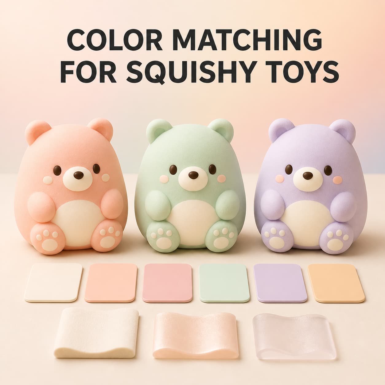
Color can determine whether a custom squishy toy feels consistent with a brand, seasonal collection, mascot, or retail display. However, selecting a color on a computer screen is only the beginning. The same color direction can look different on PU foam, TPR or TPE material, a painted coating, a translucent surface, printed facial details, and paper packaging.
For wholesale buyers, reliable custom squishy toy color matching requires a clear reference, defined color zones, physical sample review, controlled approval records, and realistic expectations about material and finish. This guide explains how brands, importers, retailers, distributors, gift companies, and online sellers can manage those decisions before bulk production.
Why Screen Colors Are Not Final Production Standards
Digital artwork is useful for communicating the intended palette, but a monitor creates color with emitted light. A physical toy, printed box, paint layer, or material chip reflects the light around it. The result can change according to the screen, room lighting, camera, material, texture, gloss, thickness, and adjacent colors.
A buyer may send the same RGB or HEX value to several suppliers and receive different-looking samples. That does not necessarily mean the digital value was entered incorrectly. It means the value was being interpreted through different physical materials and production processes.
Use digital colors to communicate the general design and color zones. For important brand colors, add a recognized physical color reference or an approved physical product sample whenever possible.
Start With a Clear Color Reference
Before requesting a custom color, identify what kind of reference you are providing. Common starting points include:
- A named Pantone or another recognized color reference
- A physical brand sample
- An approved product from a previous order
- A printed packaging sample
- CMYK values for printed artwork
- RGB or HEX values from digital brand guidelines
- A photograph or visual mood reference
These references do not have equal authority. A phone photograph may help explain whether a color should feel warm, muted, bright, or pastel, but it is affected by lighting and camera processing. A screen value is useful for digital artwork but may not define the final physical result. A labeled physical reference provides a clearer comparison for the actual sample.
State which reference controls approval. If you provide both a Pantone direction and an existing physical product, explain whether the goal is to follow the named color or visually match the product.
Create a Color-Zone Map for the Entire Toy
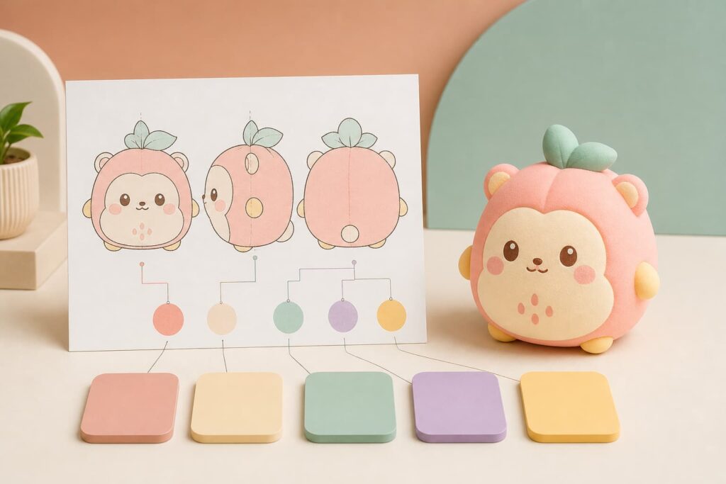
A multi-color squishy toy should have a clear map showing where every color belongs. Do not rely only on a front-view image when the side, back, top, and bottom contain additional details.
Your color-zone file can identify:
- Main body color
- Face, muzzle, belly, or secondary body area
- Ears, feet, tail, leaves, toppings, or other accents
- Eyes, mouth, blush, patterns, and printed details
- Logo or brand-mark colors
- Translucent, glitter, pearlescent, matte, or glossy areas
- Areas that should remain unpainted
Use consistent front, side, and back views. Assign each color a unique name or project code, and connect it to the correct physical or named reference. Avoid comments such as “use the same pink as before” unless the earlier approved sample is clearly identified and available to both parties.
For a new mascot or product shape, you can also review our guide on turning mascot artwork into a custom squishy toy.
Separate Body Color, Paint, Print, and Packaging Color
A custom squishy toy may use several color-producing methods in one product. Each should be reviewed separately.
Material or Base-Body Color
The base material may be mixed, molded, foamed, or otherwise prepared in a particular color direction. Material thickness, internal structure, density, and translucency can influence its appearance.
Painted or Coated Areas
PU foam squishy toys often use painted or coated surface details. Paint coverage, surface texture, coating thickness, underlying body color, and gloss level can all affect the result.
Printed Details
Eyes, mouths, logos, patterns, and small decorative elements may be applied using a suitable printing process. Ink on a flexible curved surface can appear different from the same artwork printed on flat white paper.
Packaging Printing
Paperboard, coated paper, labels, plastic bags, and insert cards each reproduce color differently. A brand color printed on a matte box may not appear identical to a soft toy body, even when both start from the same color direction.
The practical objective is usually a coordinated product and package, not an unsupported promise that every material will reflect light in exactly the same way.
Understand How Material Changes Color Appearance
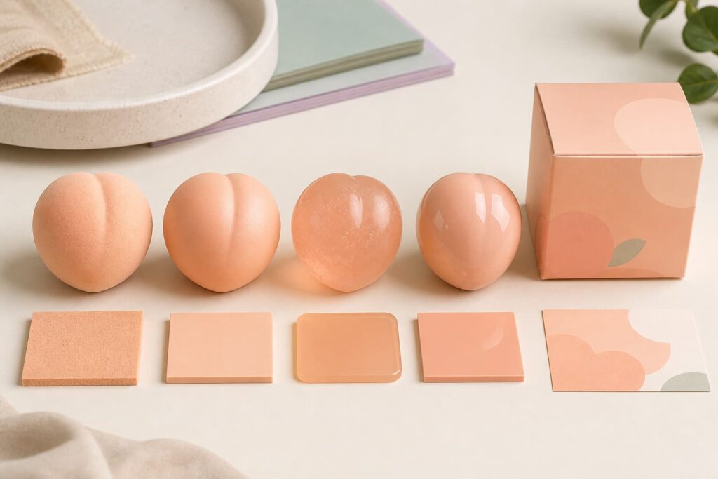
The same color reference can produce different visual impressions on different squishy toy materials.
PU Foam
PU foam products may have a fine tactile surface, painted coating, matte appearance, or other finish. The base foam, coating, texture, and rebound structure can influence how light is scattered across the surface.
TPR or TPE
TPR and TPE directions can be opaque, translucent, clear, glitter-filled, or gel-like. Transparency and material thickness can make a color look lighter, deeper, or more saturated in different parts of the same toy.
Mochi-Style Materials
Small mochi-style products often use simple pastel colors and rounded surfaces. Even within this product direction, matte, powdery, slightly glossy, or translucent appearances should be identified before approval.
When comparing material options, do not judge color independently from hand feel, surface texture, rebound, shape, and packaging. The material decision affects the entire product experience. See our wholesale squishy toy material guide for additional sourcing considerations.
Review Surface Finish Together With Color
Surface finish changes how the eye reads a color. A matte surface spreads reflection softly and may appear calmer or slightly muted. A glossy surface creates stronger highlights and can make areas look brighter or darker depending on the viewing angle. A translucent material allows light to enter the product, creating depth that cannot be represented by a flat printed chip.
When sending a color request, specify the intended finish:
- Matte
- Satin or semi-matte
- Glossy
- Translucent
- Transparent
- Pearlescent
- Glitter or particle effect
- Textured or soft-touch appearance
A named color without a finish direction leaves an important part of the appearance undefined.
Check Adjacent Colors and Contrast
Colors are rarely viewed in isolation. A cream face area can look warmer next to mint green and cooler next to coral pink. Dark outlines can make a pastel body appear lighter, while a white retail box can make the same body color appear more saturated.
During sample review, check:
- Main and secondary body colors together
- Face details against the body color
- Logo contrast and readability
- Blush, gradients, or painted transitions
- Light-colored details on translucent material
- Product colors inside the final package
- Several assortment colors displayed side by side
This is especially important when planning a coordinated retail assortment. A group of colors should feel balanced as a collection, even when each individual toy uses a different palette.
Use a Step-by-Step Color Approval Process
A structured approval process helps buyers distinguish between early visual direction and final production authorization.
1. Approve the Digital Color Layout
First confirm which color belongs in each area. At this stage, check color-zone placement, not exact physical appearance.
2. Review Available Material or Color Samples
Where appropriate, compare actual material, coating, paint, or color options. Make sure every sample is labeled so it can be identified later.
3. Review the Complete Physical Toy Sample
The complete sample shows how color interacts with the final shape, surface texture, painted details, printed features, shadows, and adjacent colors. Check the product from the front, side, back, top, and bottom.
4. Compare the Toy With Its Packaging
Place the product beside the printed packaging, label, insert, or display box. Confirm that the combination looks intentional and that important artwork remains visible.
5. Record the Approved Reference
Identify the approved sample, artwork version, date, color references, finish, and person authorized to approve it. Both the buyer and supplier should be able to identify the same reference later.
For a broader physical-product review, use our custom squishy toy sample approval checklist.
Review Colors Under Consistent Lighting
Warm indoor lighting can make cream and peach colors appear more yellow. Cool lighting may make lavender and mint colors appear bluer. Strongly colored walls, tabletops, or surrounding products can also influence perception.
For a practical comparison:
- Use a neutral viewing area
- Use consistent lighting for all samples
- Place the reference and sample close together
- Avoid judging through colored plastic packaging unless that is the final retail presentation
- Check strongly glossy or translucent items from more than one viewing angle
- Record the lighting or viewing condition used for approval
If the product will be sold in a specific environment, such as a bright retail shelf or gift display, it can also be helpful to consider how the approved combination will appear in that context.
Do Not Use Phone Photos as the Only Approval Standard
Photos and videos are useful for progress updates, but cameras automatically adjust exposure, white balance, contrast, saturation, and sharpness. Messaging platforms may also compress an image, while the buyer’s screen introduces another color interpretation.
If approval is based on photos, include the color reference in the same frame and use consistent lighting. State exactly what the photo can confirm. It may show color-zone placement and relative difference, but it may not provide a reliable final judgment of exact physical color.
For important brand colors, larger retail programs, or a color-sensitive assortment, a physical sample is usually the clearer approval reference.
Define an Acceptable Project-Specific Color Range
Soft toys, coatings, printed packaging, and flexible materials are physical products. Buyers should discuss what kind of variation is realistic for the selected material, finish, process, and order.
Do not invent a universal numerical tolerance and apply it to every squishy toy. Instead, agree on a project-specific approval method. This may involve:
- An approved physical sample
- An approved material or coating swatch
- A named color reference
- Clearly labeled lighter and darker boundary samples
- A buyer-approved visual range
- A measurement method when technically appropriate and agreed
Write down which reference takes priority if two references appear different.
Retain an Approved Sample for Bulk Production
After sample approval, keep a clearly labeled reference for production communication and later checking. The record can include:
- Product or style number
- Approved sample date
- Artwork revision
- Color reference for each zone
- Material direction
- Surface finish
- Painted and printed details
- Packaging version
- Approver name or department
Photographs are helpful supporting records, but the retained physical reference should remain identifiable. Store it away from excessive heat, direct sunlight, dust, pressure, and surfaces that could transfer color.
Know When Color Needs Reapproval
An earlier color approval should not automatically control a changed product. Reapproval may be needed when:
- The material changes
- The surface finish changes
- The base-body color changes
- The paint or printing process changes
- The product size or wall thickness changes significantly
- A translucent design becomes opaque, or the reverse
- The packaging material or printing method changes
- A new color is added to the assortment
- The approved reference is no longer available or identifiable
Record reapproval decisions in writing so the production team does not use a superseded reference.
Coordinate Product and Packaging Colors
Private label packaging often uses the same brand palette as the toy, but the package and toy may be produced from very different materials. Confirm the intended relationship rather than demanding that every surface appear identical under all lighting.
Useful packaging questions include:
- Should the box match the toy or intentionally contrast with it?
- Which color controls the brand identity?
- Is the package matte, glossy, coated, or uncoated?
- Will a transparent window change how the toy appears?
- Does the background provide enough contrast for the product?
- Are color names and SKU images correct for every variation?
- Are retail packs and display boxes using the same approved artwork version?
For more packaging planning, see our guide on custom squishy toy packaging for wholesale orders.
Common Color-Matching Mistakes
Approving From an Uncalibrated Screen Only
A digital image cannot fully represent the final material, finish, texture, or lighting condition.
Providing Several Conflicting References
If the Pantone direction, printed sample, website color, and physical product all look different, identify which one controls approval.
Using Vague Comments
Comments such as “make it brighter” or “the color feels wrong” can be interpreted differently. Identify the exact zone and the desired direction relative to a controlled reference.
Approving an Isolated Color Chip Only
A chip cannot show how the color will look on the full shape beside facial details, other colors, surface highlights, and packaging.
Ignoring Translucency and Thickness
A translucent material may look different at thin edges and thick body areas. Review the completed form, not only a flat sample.
Changing Packaging After Product Approval
A different package background or window can change the presentation of the approved toy color. Review the product and package together.
What to Send With a Custom Color Inquiry
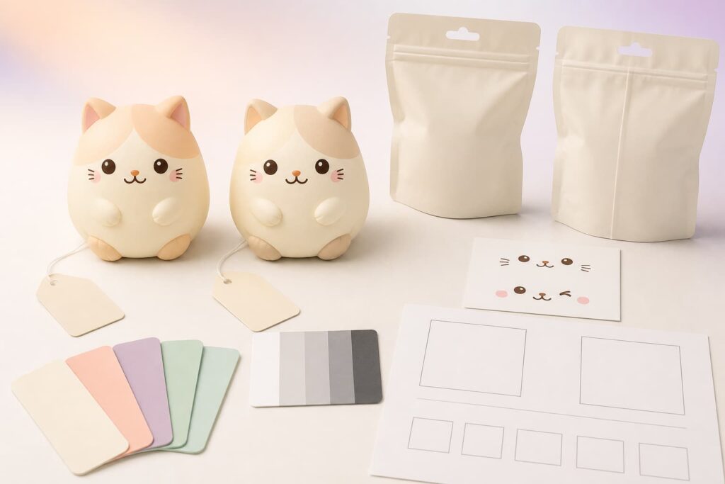
To receive a more useful discussion, prepare:
- Product idea, drawing, or reference image
- Target size
- Material or hand-feel direction
- Estimated order quantity
- Front, side, and back color-zone artwork
- Named color references or physical samples
- Required matte, glossy, translucent, glitter, or other finish
- Printed logo and facial-detail artwork
- Number of colors or assortment variations
- Packaging direction
- Target market and sales channel
- Any buyer-specific color approval method
Frequently Asked Questions
Can custom squishy toys be matched to a Pantone color?
A Pantone reference can provide a clearer target for suitable custom-color projects. The final appearance still depends on the material, coating, texture, transparency, and process. Approve the result on the actual sample rather than relying on the code alone.
Is a HEX or RGB value enough for production?
HEX and RGB values are designed for digital use. They can communicate the screen design, but they do not define how a physical foam, elastomer, paint, ink, or printed carton will reflect light.
Why does my sample look different from the computer image?
Monitor settings, room lighting, camera processing, material texture, surface gloss, and adjacent colors can all affect appearance. Compare the physical sample with the approved physical reference under consistent lighting.
Should the toy and packaging use exactly the same color?
They can share the same color direction, but foam, flexible elastomer, paint, plastic film, and printed paper may not appear identical. Buyers should approve the combined visual result.
Can I approve color from photos or video?
Photos and videos can support communication, especially for placement and relative comparison. For color-sensitive projects, they should not automatically replace a physical sample because cameras, compression, and screens can alter color.
Does a matte finish look different from a glossy finish?
Yes. Matte surfaces create softer reflections, while glossy surfaces produce stronger highlights and angle-dependent changes. Finish should be confirmed together with the color.
Does bulk production always look identical to one sample?
Physical production can have variation depending on the material and process. The buyer and supplier should agree on the approved reference and the project-specific checking method before bulk production.
Start a Custom Squishy Toy Color Project
Jinhua Dongyu Toys supports OEM and ODM squishy toy development for brands, importers, distributors, retailers, gift companies, and online sellers. Project directions can include PU foam, TPR or TPE hand feel, slow-rising toys, mochi-style products, custom shapes, color plans, surface finishes, printed details, individual packaging, and display boxes.
Send your design, target size, quantity, material direction, color references, surface-finish request, packaging plan, and destination market. You can review our squishy toy product directions, learn about the custom production process, or contact Dongyu Toys to discuss your project. “`