Dongyu Insights
Custom Squishy Toy Color Matching: Pantone, Gradients & Batch Approval
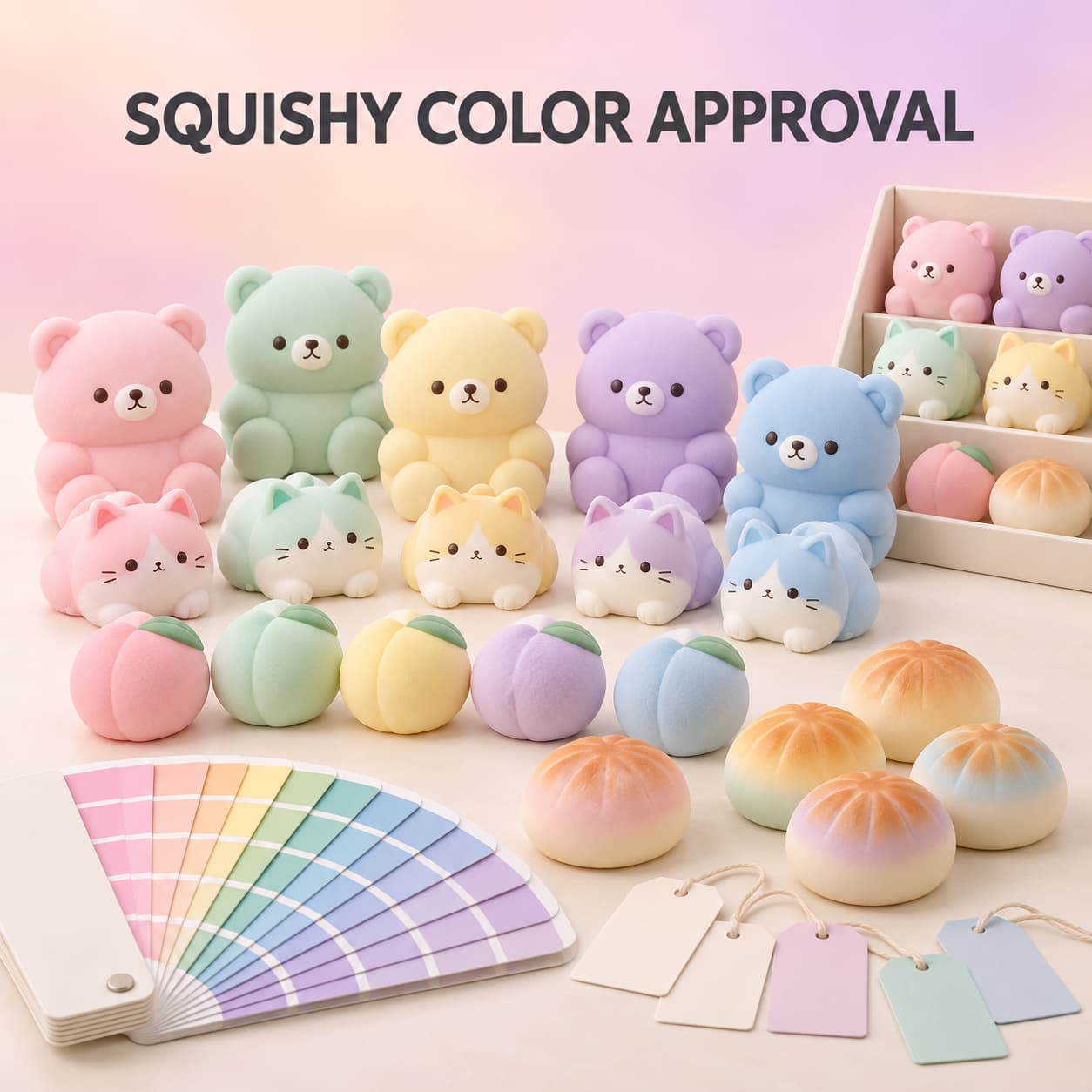
Custom squishy toy color matching is not finished when a buyer sends a HEX code, an RGB value, or a screenshot. Those references can start a conversation, but they do not show exactly how a color will look on slow-rising PU foam, glossy TPR, translucent TPE, a printed logo, or a retail package. Material, surface texture, coating, opacity, lighting, and even the size of the colored area can change what the eye sees.
For wholesale and private-label projects, the practical goal is not to make every component look identical under every condition. It is to create a clear target, approve the target on the actual material, record the approved sample, and define how production will be compared with it. This guide shows buyers how to build that process for solid colors, gradients, printed details, multiple colorways, and packaging.
Why a Screen Color Is Not a Production Standard
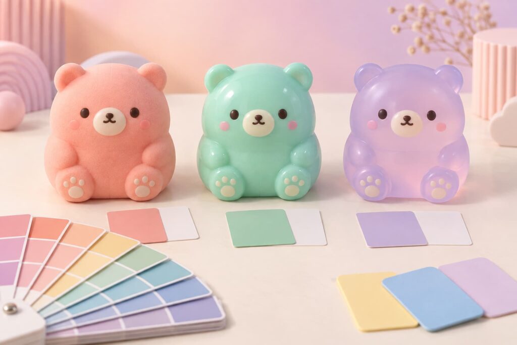
Digital color helps a designer communicate quickly, but a screen emits light while a physical toy reflects it. Screen calibration, brightness, device type, ambient light, and image compression can all affect the display. Pantone also advises using a current physical color reference when a project moves from digital design to a physical product.
A buyer can still include HEX, RGB, CMYK, or a digital mood board in the brief. Treat them as communication references, not the only approval criterion. If a brand color matters, provide a current physical reference, an approved product sample, or an agreed named color standard. The supplier can then evaluate what is achievable on the selected material and finish.
Build a Color Specification Before Sampling
A useful specification connects every color to a part, material, finish, and revision. “Pastel pink body” is too vague when the product also has cheeks, ears, printed eyes, a hang tag, and a display box.
For every SKU or colorway, record:
- part or zone: body, belly, face, accessory, logo, package background, insert, or display header;
- reference: physical swatch, named color code, approved master sample, or authorized brand standard;
- material: PU foam, TPR, TPE, coating, ink, label stock, film, or paperboard;
- appearance: opaque, translucent, matte, satin, glossy, pearlescent, or airbrushed;
- application: molded body color, surface coating, spray gradient, pad print, screen print, or package printing;
- sample revision: date, version, photographs, and approval status;
- viewing condition: the agreed lighting and background used for comparison.
This structure also prevents a common mistake: approving a color name without approving where and how it will be produced.
The Same Color Can Look Different on PU, TPR, and TPE
The material route affects color appearance. A porous or finely textured PU foam surface scatters light differently from a smooth glossy elastomer. A translucent TPR or TPE part may appear lighter at the edge and deeper in thicker areas. A coating can change gloss and saturation even when the underlying pigment remains similar.
Slow-rising PU foam
PU foam squishies often combine a molded foam body with surface paint or coating. Buyers should evaluate the body color together with texture, coating coverage, squeeze recovery, and painted details. A warm bakery gradient, for example, is not one flat color; it has a base tone, a darker sprayed zone, a transition, and a coverage limit.
TPR and TPE products
TPR and TPE directions may be opaque, translucent, clear, glossy, matte, or lightly powdered depending on the product construction. Color should be approved on the final material and thickness. A swatch molded as a thin plaque may not look identical to a thick rounded mochi squishy.
Use the physical sample to approve the complete visual result. The material name alone does not guarantee a specific hue, softness, transparency, gloss, tack, or recovery behavior. Buyers can review broader material and development choices in Dongyu Toys’ wholesale customization guide.
Separate Body Color, Surface Color, Print, and Packaging
A private-label squishy can contain several color systems. Each one needs its own reference and approval method.
- Body color: pigment in the molded material or foam base.
- Surface color: paint, coating, spray, powder, or finish applied after molding.
- Printed detail: eyes, mouth, logo, pattern, or small graphics applied to a curved surface.
- Packaging color: ink printed on paperboard, label stock, film, or an insert.
A brand red printed on coated paperboard will not automatically look the same on a soft peach-colored toy. The base material, opacity, print method, texture, and gloss differ. Instead of writing “all reds must match exactly,” identify the desired relationship: exact physical match where achievable, a visually coordinated family, or a deliberately contrasting logo.
How to Approve Solid Colors
For a single solid color, start with the closest practical physical target. Ask the supplier to prepare the color on the intended material and finish. Review it next to the reference on a neutral background rather than relying only on a phone photo.
- Confirm the exact SKU, material, surface, and sample revision.
- Compare the sample and reference under the agreed light source.
- Check the sample again under a second likely environment, such as retail or home lighting.
- Review gloss, translucency, texture, and neighboring colors, not only hue.
- Approve, reject, or request a controlled adjustment with clear notes.
- Label and retain the approved sample as the master reference.
Avoid approval comments such as “make it nicer” or “a little more premium.” A better note is “reduce the orange cast and move closer to the supplied physical coral reference while keeping the matte finish.”
Define Gradients and Airbrushed Effects as Zones
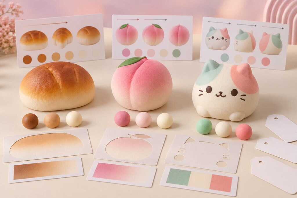
Gradients are common on bread, fruit, dessert, paws, cheeks, and character accents. They need more information than two endpoint colors. Describe the effect as a controlled area:
- starting color and finishing color;
- direction of the transition;
- percentage or physical area covered;
- soft or sharp boundary;
- maximum dark zone and minimum light zone;
- protected areas that must remain clean;
- relationship to eyes, face, logo, seam, or molded texture;
- acceptable natural variation between units.
Use front, back, side, and top reference views when the gradient wraps around a three-dimensional form. For multi-color character designs, a color-zone diagram is often more useful than a beauty rendering because it shows the intended boundaries and orientation.
Approve Faces, Logos, and Small Printed Details at Actual Size
A logo that is clear in a large PDF may become unreadable on a small rounded toy. Fine lines can close, small gaps can fill, and compression can distort a print area. Review artwork at the intended size and request a decorated physical sample.
Check:
- logo dimensions and print location;
- minimum line width and spacing;
- ink opacity over the body color;
- alignment with molded features;
- distortion when the toy is squeezed;
- rub, flex, and adhesion behavior appropriate to the product;
- authorized artwork revision and ownership.
If the surface is too curved or textured, move detailed branding to a hang tag, label, window box, or display header. The article on custom squishy toy development can help buyers organize shape, artwork, material, and packaging requirements before requesting a sample.
Review Color Under Controlled and Realistic Lighting
Colors may appear to match under one light and separate under another, a phenomenon known as metamerism. X-Rite recommends controlled visual evaluation and comparison under lighting relevant to the final product environment. For squishy toys, a practical review can include agreed daylight-type lighting plus a likely retail or home condition.
Keep the viewing setup repeatable:
- use the same neutral background and sample orientation;
- avoid mixed window, ceiling, and colored decorative light;
- compare samples side by side rather than from memory;
- allow the viewer’s eyes to adapt before deciding;
- record the light source or agreed condition;
- check the assembled product, not only isolated material pieces.
If numerical color measurement is required, agree in advance on the instrument, geometry, illuminant, observer, sample area, target data, and tolerance. A universal Delta E limit should not be copied into a purchase order without confirming whether the surface, translucency, texture, and measurement method make it meaningful.
Control a Multi-Colorway Assortment
A wholesale display may contain pink, mint, yellow, lavender, and blue versions of one design. Label every colorway with a unique code. Do not approve “the pastel set” as one item.
A useful assortment sheet includes:
- SKU and colorway code;
- front and back image;
- body, face, accent, and accessory colors;
- units per display and case;
- approved sample revision;
- package color and label relationship;
- substitution rules, if any.
This prevents two problems: a production color being mistaken for another approved version, and the final display receiving an unintended ratio. For online sellers, the same codes should connect product photography, listing variants, barcodes, picking, and customer service.
Coordinate Product and Packaging Color Without Forcing a False Match
Packaging should support the toy on the shelf. A pastel product may need a cleaner neutral background for visibility; a translucent toy may need an insert that prevents the package interior from changing its apparent color. Clear film and window materials can also add reflections or a color cast.
Approve the product inside the proposed package. Review the front-facing orientation, background, window, insert, printed colors, and display arrangement. If a package uses a licensed or corporate color standard, confirm the print proof separately from the toy sample and define whether the two surfaces must match or coordinate.
Create a Golden Sample and a Change-Control Record
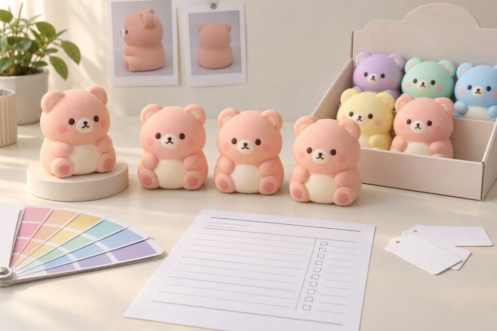
Once the buyer approves the final sample, identify it as the golden sample or master reference. The record should state what it approves: shape, material, color, gradient, print, finish, hand feel, packaging, and artwork revision. A sample cannot control an attribute that was never reviewed.
For production review, compare selected units with the approved reference. Record observations and photographs. If pigment, material supplier, coating, print ink, mold, process, package substrate, or production location changes, determine whether a new sample or targeted reapproval is needed.
Retained samples are especially helpful for repeat orders. Physical references can age, fade, yellow, or collect surface contamination, so store them appropriately, date them, and replace the control when necessary.
Color Approval Checklist for an RFQ
Send the following information with a custom squishy inquiry:
- original design, authorized artwork, and intended sales channel;
- target market and age presentation;
- product size, material direction, feel, and finish;
- physical color references or named color codes for each zone;
- opacity, translucency, gloss, gradient, and coating requirements;
- logo artwork, actual print size, and preferred position;
- number of colorways and assortment ratio;
- package type, substrate, artwork, and display plan;
- sample approval contacts and revision process;
- estimated quantity, destination, and target launch timing.
Dongyu Toys’ sampling and production process outlines the route from brief to sample and bulk order. Final feasibility, price, MOQ, schedule, color method, packaging, and target-market requirements must be confirmed for the specific project.
Frequently Asked Questions
Can a manufacturer match a HEX or RGB color exactly?
A HEX or RGB value is useful for digital communication, but it is not a complete physical production standard. Approve the result on the actual material, finish, and product geometry. A current physical reference or approved master sample gives the parties a clearer comparison target.
Should I use a Pantone reference for custom squishy toys?
A current physical Pantone reference can provide a common target, but the finished appearance still depends on material, texture, opacity, coating, print method, and lighting. Use the named reference together with a physical sample approval rather than treating the code as a guarantee.
Why does the same pastel color look different on PU foam and TPR?
PU foam and TPR can differ in texture, gloss, opacity, thickness, and coating. Those properties change how light interacts with the surface. Approve each material route separately, even when the palette is meant to feel coordinated.
How should a gradient squishy sample be approved?
Define endpoint colors, direction, coverage, transition softness, protected areas, face placement, and acceptable unit-to-unit variation. Review multiple views and keep a labeled physical master sample for production comparison.
Can the toy color and packaging color be identical?
They may be visually close, but different materials and print processes can prevent an exact match. Decide whether the requirement is an exact measured target, a visual match under agreed lighting, or a coordinated color family, then approve product and package samples separately.
What should I approve before bulk production?
Approve the physical product, each colorway, gradients, printed details, finish, hand feel, package structure, print proof, assortment ratio, and documented revision. Also confirm the applicable target-market testing, labeling, and traceability plan for the final construction.
Make Color Approval Easy to Repeat
Reliable color is the result of a repeatable decision process: define the target, separate the materials and applications, approve physical samples under agreed lighting, label every revision, and retain a master reference. That approach gives buyers more control than a screenshot and gives the supplier a clearer standard for sampling and production.
Planning custom colorways, gradients, logo printing, or coordinated private-label packaging? Browse Dongyu Toys’ product directions and send your design, color references, material preference, quantity, destination, and launch goal through the inquiry form. A precise brief makes the first sample more useful and reduces subjective color changes later.